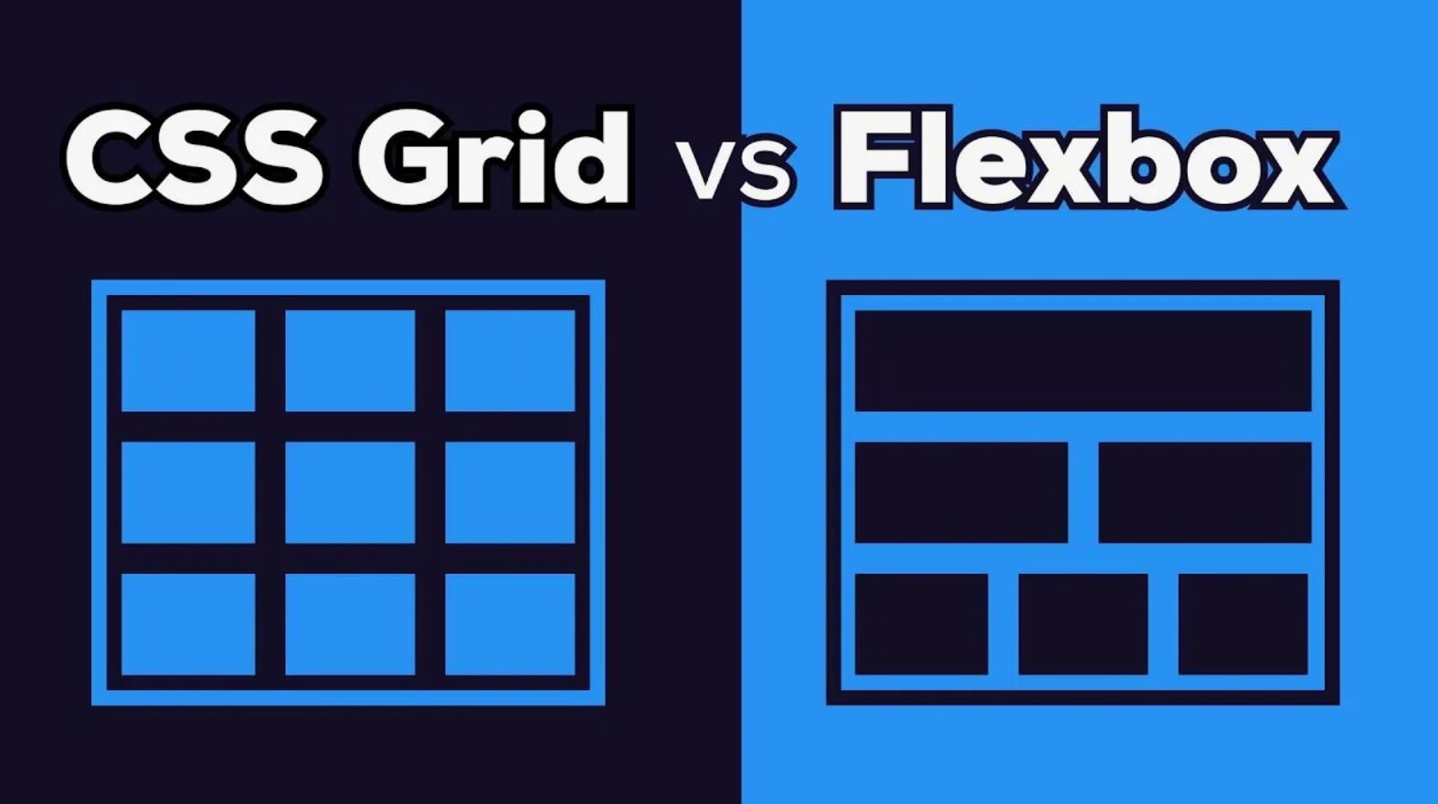
CSS шпаргалка — это быстрый справочник по каскадным таблицам стилей. Здесь собраны все основные свойства, селекторы, значения и современные техники вёрстки.
Селекторы
Базовые селекторы
/* Универсальный */
* { margin: 0; }

/* По тегу /
div { color: red; }

/ По классу /
.class { color: red; }

/ По ID /
#id { color: red; }

/ По атрибуту /
[type="text"] { border: 1px solid; }
[href^="https"] { color: green; }
[href$=".pdf"] { background: url(pdf.png); }
[href="google"] { color: blue; }
Комбинаторы
/* Дочерний (прямой) /
.parent > .child { color: red; }

/ Потомок (любой уровень) /
.parent .descendant { color: red; }

/ Сосед (следующий) /
.prev + .next { color: red; }

/ Соседи (все следующие) /
.prev ~ .siblings { color: red; }
Псевдоклассы и псевдоэлементы
/ Состояния ссылок /
a:link { color: blue; }
a:visited { color: purple; }
a:hover { color: red; }
a:active { color: green; }

/ Состояния элементов /
input:focus { border: 2px solid blue; }
input:disabled { background: gray; }
input:checked { box-shadow: 0 0 5px blue; }

/ Позиция в списке /
li:first-child { color: red; }
li:last-child { color: blue; }
li:nth-child(odd) { background: #f0f0f0; }
li:nth-child(3n) { color: green; }

/ Псевдоэлементы /
p::before { content: "→ "; }
p::after { content: " ←"; }
p::first-letter { font-size: 2em; }
p::first-line { font-weight: bold; }

/ Not selector /
:not(.excluded) { color: red; }
Базовые свойства
Цвета и фон
/ Цвет текста /
color: red;
color: #ff0000;
color: rgb(255, 0, 0);
color: rgba(255, 0, 0, 0.5);
color: hsl(0, 100%, 50%);
color: var(--primary-color);

/ Фон /
background: red;
background-color: #f0f0f0;
background-image: url('image.jpg');
background-size: cover; / contain, auto /
background-position: center;
background-repeat: no-repeat;
background-attachment: fixed;

/ Градиенты /
background: linear-gradient(red, blue);
background: linear-gradient(45deg, red, orange, yellow);
background: radial-gradient(circle, red, blue);
Текст
/ Шрифт /
font-family: Arial, sans-serif;
font-size: 16px;
font-size: 1.2em;
font-size: 1.2rem;
font-weight: bold; / normal, 100-900 /
font-style: italic;
font-variant: small-caps;

/ Выравнивание /
text-align: left; / center, right, justify /
text-decoration: underline; / none, overline, line-through /
text-transform: uppercase; / lowercase, capitalize /
text-indent: 2em;
text-shadow: 2px 2px 4px rgba(0,0,0,0.5);

/ Межстрочный интервал /
line-height: 1.5;
line-height: 24px;

/ Межбуквенный интервал /
letter-spacing: 2px;
word-spacing: 4px;

/ Отображение /
white-space: nowrap; / pre, pre-wrap, normal /
word-wrap: break-word;
word-break: break-all;
Блочная модель
/ Ширина и высота /
width: 100%;
height: 200px;
min-width: 300px;
max-width: 1200px;
min-height: 100vh;

/ Отступы (padding) /
padding: 10px; / все стороны /
padding: 10px 20px; / верх/низ - лево/право /
padding: 10px 20px 30px; / верх - лево/право - низ /
padding: 10px 20px 30px 40px; / верх - право - низ - лево /
padding-top: 10px;
padding-right: 20px;
padding-bottom: 30px;
padding-left: 40px;

/ Внешние отступы (margin) /
margin: 10px;
margin: 10px auto; / центрирование /
margin-top: 10px;
margin-right: 20px;
margin-bottom: 30px;
margin-left: 40px;

/ Границы (border) /
border: 1px solid #ccc;
border-width: 1px 2px 3px 4px;
border-style: solid; / dashed, dotted, double, none /
border-color: red;
border-radius: 4px;
border-radius: 50%; / круг /
border-radius: 10px 20px 30px 40px;

/ Box-sizing /
box-sizing: border-box; / padding и border входят в width /

/ Отображение /
display: block;
display: inline;
display: inline-block;
display: none;
display: flex;
display: grid;

/ Видимость /
visibility: visible; / hidden, collapse /
opacity: 0.5;
Flexbox
Контейнер (родитель)
.container {
 display: flex;
 flex-direction: row; / column, row-reverse, column-reverse /
 flex-wrap: wrap; / nowrap, wrap-reverse /
 justify-content: flex-start; / center, flex-end, space-between, space-around, space-evenly /
 align-items: stretch; / flex-start, center, flex-end, baseline /
 align-content: stretch; / flex-start, center, flex-end, space-between /
 gap: 20px;
 row-gap: 10px;
 column-gap: 20px;
Элементы (дети)
.item {
 flex: 1; / flex-grow: 1, flex-shrink: 1, flex-basis: 0% /
 flex-grow: 1; / 0 - не растягивается, 1+ - растягивается /
 flex-shrink: 1; / 0 - не сжимается /
 flex-basis: auto; / базовая ширина /
 align-self: auto; / flex-start, center, flex-end, stretch /
 order: 2; / порядок в контейнере /
Примеры Flexbox
/ Вертикальное центрирование /
.container {
 display: flex;
 justify-content: center;
 align-items: center;
 height: 100vh;


/ Горизонтальное центрирование /
.container {
 display: flex;
 justify-content: center;


/ Навигация с пространством между элементами /
.nav {
 display: flex;
 justify-content: space-between;


/ Карточки в ряд /
.cards {
 display: flex;
 gap: 20px;
 flex-wrap: wrap;

.card {
 flex: 1 1 300px;
CSS Grid
Контейнер (родитель)
.container {
 display: grid;
 / Колонки /
 grid-template-columns: 200px 1fr 2fr;
 grid-template-columns: repeat(4, 1fr);
 grid-template-columns: repeat(auto-fit, minmax(200px, 1fr));

 / Строки /
 grid-template-rows: auto 100px 1fr;
 grid-template-rows: minmax(100px, auto);

 / Интервалы /
 gap: 20px;
 row-gap: 20px;
 column-gap: 20px;

 / Выравнивание /
 justify-items: stretch; / start, center, end /
 align-items: stretch; / start, center, end /
 justify-content: start; / center, end, space-around, space-between /
 align-content: start; / center, end, space-around, space-between /
Элементы (дети)
.item {
 / По колонкам /
 grid-column-start: 1;
 grid-column-end: 3;
 grid-column: 1 / 3;
 grid-column: span 2;

 / По строкам /
 grid-row-start: 1;
 grid-row-end: 3;
 grid-row: 1 / 3;
 grid-row: span 2;

 / Выравнивание внутри ячейки /
 justify-self: start; / center, end, stretch /
 align-self: start; / center, end, stretch /
Примеры Grid
/ Сетка с 3 колонками /
.grid {
 display: grid;
 grid-template-columns: repeat(3, 1fr);
 gap: 20px;


/ Макет страницы /
.page {
 display: grid;
 grid-template-columns: 250px 1fr;
 grid-template-rows: auto 1fr auto;
 grid-template-areas:
 "header header"
 "sidebar main"
 "footer footer";

.header { grid-area: header; }
.sidebar { grid-area: sidebar; }
.main { grid-area: main; }
.footer { grid-area: footer; }

/ Адаптивные колонки /
.gallery {
 display: grid;
 grid-template-columns: repeat(auto-fit, minmax(250px, 1fr));
 gap: 20px;
Анимации и переходы
/ Transitions /
.element {
 transition: property duration timing-function delay;
 transition: all 0.3s ease;
 transition: background 0.3s ease, transform 0.5s ease-in-out;


/ Timing functions */
/* ease, linear, ease-in, ease-out, ease-in-out, cubic-bezier() /

/ Пример перехода /
.button {
 background: blue;
 transition: background 0.3s ease, transform 0.2s ease;

.button:hover {
 background: darkblue;
 transform: scale(1.05);


/ Keyframes /
@keyframes slideIn {
 0% {
 transform: translateX(-100%);
 opacity: 0;

 100% {
 transform: translateX(0);
 opacity: 1;


@keyframes pulse {
 0%, 100% {
 transform: scale(1);

 50% {
 transform: scale(1.05);


/ Animation /
.element {
 animation: slideIn 0.5s ease forwards;
 animation-name: pulse;
 animation-duration: 2s;
 animation-iteration-count: infinite;
 animation-timing-function: ease-in-out;
 animation-delay: 1s;
 animation-fill-mode: forwards; / none, backwards, both /
Позиционирование
/ Static (по умолчанию) /
position: static;

/ Relative (относительно себя) /
position: relative;
top: 10px;
left: 20px;

/ Absolute (относительно родителя с position) /
position: absolute;
top: 0;
right: 0;
bottom: 0;
left: 0;

/ Fixed (относительно окна) /
position: fixed;
top: 0;
left: 0;
z-index: 1000;

/ Sticky (гибрид) /
position: sticky;
top: 20px;
z-index: 100;

/ Z-index /
z-index: 1;
z-index: 100;
z-index: auto;
Media Queries
/ Типичные брейкпоинты */
/* Мобильные устройства /
@media (max-width: 768px) {
 .mobile-hidden { display: none; }


/ Планшеты /
@media (min-width: 768px) and (max-width: 1024px) {
 .tablet-hidden { display: none; }


/ Десктопы /
@media (min-width: 1024px) {
 .desktop-hidden { display: none; }


/ Dark theme /
@media (prefers-color-scheme: dark) {
 body { background: #1a1a1a; color: #fff; }


/ Retina дисплеи /
@media (-webkit-min-device-pixel-ratio: 2) {
 .logo { background-image: url('logo@2x.png'); }
Полезные сниппеты
/ Очистка списков /
ul, ol {
 list-style: none;
 padding: 0;
 margin: 0;


/ Сброс отступов */
* {
 margin: 0;
 padding: 0;
 box-sizing: border-box;


/* Запрет выделения текста /
.no-select {
 user-select: none;


/ Сглаживание шрифтов /
body {
 -webkit-font-smoothing: antialiased;
 -moz-osx-font-smoothing: grayscale;


/ Тени /
.box-shadow {
 box-shadow: 2px 2px 10px rgba(0,0,0,0.1);
 box-shadow: 0 4px 6px rgba(0,0,0,0.1), 0 1px 3px rgba(0,0,0,0.08);


/ Скругление /
.rounded {
 border-radius: 8px;

.rounded-full {
 border-radius: 9999px;


/ Обрезка текста /
.ellipsis {
 white-space: nowrap;
 overflow: hidden;
 text-overflow: ellipsis;


/ Визуально скрытый (для доступности) */
.sr-only {
 position: absolute;
 width: 1px;
 height: 1px;
 padding: 0;
 margin: -1px;
 overflow: hidden;
 clip: rect(0, 0, 0, 0);
 border: 0;
Итог
Эта шпаргалка покрывает все основные CSS-свойства, селекторы и современные техники вёрстки. Используйте её для быстрого поиска нужных стилей.